How Do Different High-Visibility Colors Impact Brand Perception?
Discover how high-visibility colours influence brand perception and how to use them effectively in marketing materials like bollard covers and signage.
Colour plays a significant role in the way we perceive brands. From the first glance at a logo to the design of promotional materials, colours influence emotions, behaviours, and decisions. In the world of marketing and design, high-visibility colours are often used to attract attention, convey messages, and create lasting impressions. This blog explores how different high-visibility colours impact brand perception, with a focus on their practical applications, including bollard covers and correx board printing.
The Power of Colour in Brand Perception
Colours are more than just aesthetic choices; they convey meaning and evoke emotions. According to colour psychology, certain colours are linked to specific feelings and associations, which marketers can leverage to create an emotional connection with their audience. High-visibility colours, in particular, are used to grab attention and ensure that messages are seen in busy, cluttered environments.
The Role of High-Visibility Colours
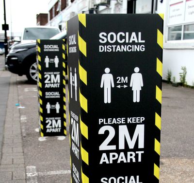
High-visibility colours are typically bright and bold, making them easy to notice even from a distance. They are commonly used for safety, signage, and promotional materials, where drawing attention is critical. These colours can have a powerful impact on how a brand is perceived, especially in high-traffic or outdoor settings.
Research shows that high-visibility colours, such as neon yellow, bright orange, and vivid red, not only increase the visibility of objects but also influence how a brand is perceived. In this blog, we’ll explore how different high-visibility colours are linked to various emotional responses and brand perceptions.
The Impact of Specific High-Visibility Colours
1. Yellow: Optimism and Attention
Yellow is a high-visibility colour that immediately draws the eye. It is often associated with positivity, energy, and creativity. In branding, yellow is used to convey warmth and optimism. However, overuse of yellow can lead to feelings of anxiety or caution, so it’s important to use it strategically.
- Impact on Brand Perception: Yellow can make a brand feel approachable and friendly. It works well for brands that want to evoke feelings of happiness, warmth, and fun. It’s often used in the food and entertainment industries for this reason.
- Applications: High-visibility yellow bollard covers and signage are ideal for attracting attention and ensuring safety in busy or cluttered environments.
|
Colour |
Emotional Response |
Ideal Industry |
|
Yellow |
Optimism, warmth, energy |
Food, entertainment, retail |
2. Orange: Energy and Urgency
Orange combines the energy of red with the friendliness of yellow. It’s an active and vibrant colour that conveys excitement, urgency, and enthusiasm. Orange is often used to encourage quick decision-making, which makes it highly effective in call-to-action messages.
- Impact on Brand Perception: Brands that use orange tend to be seen as dynamic, fun, and action-oriented. It’s an excellent colour for businesses that want to generate excitement and urgency, such as limited-time offers or flash sales.
- Applications: High-visibility orange bollard covers and signage are commonly used in construction zones and traffic areas, where immediate attention is required.
|
Colour |
Emotional Response |
Ideal Industry |
|
Orange |
Excitement, urgency, enthusiasm |
Retail, construction, events |
3. Red: Passion and Strength
Red is a bold, attention-grabbing colour associated with power, passion, and excitement. It is known to stimulate emotions and encourage action, often making it a popular choice for sale signs, promotional banners, and call-to-action buttons.
- Impact on Brand Perception: Red is often used to evoke a sense of urgency or importance. Brands that use red are perceived as passionate, strong, and energetic. However, excessive use of red can also create feelings of aggression or danger.
- Applications: Red is a great colour for high-visibility bollard covers and signage that need to make an impact, such as emergency exits or hazardous areas.
|
Colour |
Emotional Response |
Ideal Industry |
|
Red |
Passion, urgency, strength |
Emergency services, retail, entertainment |
4. Green: Safety and Sustainability
Green is a high-visibility colour that is typically associated with safety, nature, and sustainability. It conveys a sense of calm and balance, making it an excellent choice for brands that want to promote health, environmental awareness, or financial growth.
- Impact on Brand Perception: Green is often used by brands that want to promote their commitment to sustainability or health. It is calming and reassuring, making it a go-to colour for environmentally conscious brands or those in the wellness industry.
- Applications: High-visibility green bollard covers are effective in areas where safety and environmental responsibility are key messages, such as green zones or eco-friendly initiatives.
|
Colour |
Emotional Response |
Ideal Industry |
|
Green |
Safety, sustainability, calm |
Environmental, health, finance |
5. Blue: Trust and Dependability
Blue is another high-visibility colour that is frequently used in branding. It’s associated with trust, reliability, and professionalism. It’s commonly used by financial institutions, tech companies, and healthcare brands to convey a sense of security and expertise.
- Impact on Brand Perception: Brands that use blue are seen as dependable, trustworthy, and stable. It’s a calming colour that promotes confidence and is often used in industries where security is a priority.
- Applications: Blue bollard covers and signage are ideal for areas where security and professionalism need to be emphasised.
|
Colour |
Emotional Response |
Ideal Industry |
|
Blue |
Trust, dependability, professionalism |
Financial, healthcare, technology |

Practical Tips for Effective Use of High-Visibility Colours in Branding
1. Strategic Placement
When using high-visibility colours in branding, placement is crucial. For bollard covers, ensuring that the colours are placed in areas where they are most likely to catch the eye such as entrances, walkways, or busy areas can significantly increase their impact.
2. Balance and Consistency
While high-visibility colours are powerful, it’s essential to balance them with more neutral tones to prevent overwhelming the audience. Consistent use of high-visibility colours across branding materials whether on bollard covers or correx board printing helps create a cohesive brand identity.
3. Test and Evaluate
Different colours resonate with different audiences. Test the impact of various high-visibility colours with your target audience to determine which ones elicit the best emotional responses. This can be done through focus groups, surveys, or A/B testing.
Conclusion
High-visibility colours have a profound impact on brand perception. By understanding the psychological effects of colours such as yellow, orange, red, green, and blue, businesses can strategically choose colours that align with their brand values and engage their target audience. Whether using bollard covers to create safety or correx board printing to boost visibility, the right colour choice can make a significant difference in how a brand is perceived.
For professional and high-quality bollard covers and printing solutions, VC Print offers tailored services to meet the needs of any business, ensuring your brand stands out effectively and safely.
What's Your Reaction?


.jpg)
